Mapping the Invisible
How Data Visualisation Guided Wellcome Trust's £75m Investment Strategy
THE CHALLENGE
Wellcome Trust's £75 million Data for Science and Health programme needed to understand a fragmented landscape of 240+ open-source tools. Without clear visibility into tool quality, community health, and interconnections, strategic investment decisions were being made in the dark.
THE INSIGHT
Through 16 weeks of research—including analysis of international academic publications and interviews with 22 global experts—Hetco discovered that tool robustness wasn't just about functionality. Community size, update frequency, and openness levels were equally critical indicators. The real challenge was making these complex relationships visible and comparable at scale.
THE SOLUTION
We created a comprehensive data visualisation system that mapped the entire ecosystem. Each tool received a unique algorithmic icon that conveyed its robustness at a glance. Inspired by microscopic imagery, the visual system used geometric and figurative elements to reflect the human nature of data, making complex technical relationships intuitive to understand.
THE IMPACT
Wellcome Trust now has unprecedented visibility into the open-source landscape, enabling strategic investment decisions based on evidence rather than assumption. The tool has become essential for identifying funding opportunities, partnership prospects, and gaps in the ecosystem—directly informing their execution strategy.
CREDITS
Designed for the Wellcome Trust
Collaboration with research and data science duo Hetco Design.
Winner — Best Use of Data
Design Week Awards 2020
—
Visual identity
Graphic Design
Data Visualisation
Print and UI design
Digital Design Guide


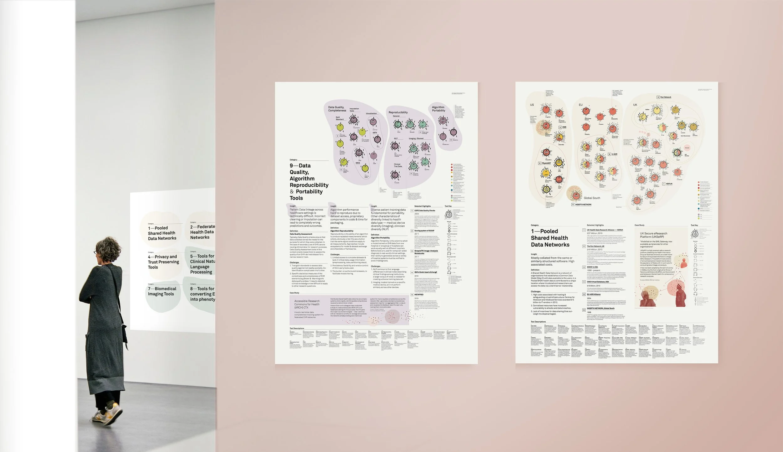
Image credit: Photo by Marcus Ganahl on Unsplash